SAN JOSE, Calif. – If you were in downtown San Jose on Thursday night, you had to work pretty hard to avoid catching sight of the Earthquakes’ new logo.
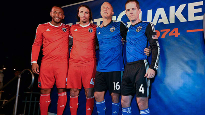
Completing a rebranding two years in the making, the Quakes unveiled their redesigned crest and two new jerseys by projecting their images onto the side of a 12-story building.
The spectacle delighted a capacity crowd at the San Pedro Square Market, who soaked up speeches by former Quakes greats Johnny Moore and Troy Dayak as well as giving a first listen to “Never Say Die,” the club’s new anthem penned by South Bay native Lars Frederiksen.
“I thought it was tremendous, to see thousands of people out here cheering for the Earthquakes, celebrating our storied history,” Quakes president David Kaval told reporters, “while at the same time looking forward to a very optimistic future with a new stadium and really a path forward that’s going to elevate this club to the top of MLS and professional sports.”
Perhaps the most surprising aspect of the rebranding – which was engineered by Portland-based design house Fiction – was the color change on one of the uniforms.
San Jose’s primary jersey remains blue, with black sleeves to match black shorts. The secondary kit, however, now harkens back to the original Quakes franchise, with an all-red look. This will be the first time a San Jose club wears a predominantly red jersey since the Quakes’ first incarnation did so in the North American Soccer League (1974-84) and Western Soccer Alliance (1985-88).
“When we talked to people, the connection to the early NASL-era Quakes was very strong,” Kaval said. “We actually nicknamed it, internally, ‘The Aftershock’ – and it was basically the children of the original group of Earthquakes fans, who were 6, 7, 10 years old at Spartan Stadium, seeing George Best, Paul Child, Mani Hernandez, all these great players play at a time when American soccer was really in its earliest era. And those people carried forward a great passion and excitement for the sport that we wanted to honor with the red.”
Kaval said the club won’t have a third jersey for 2014, and that the red will be used sometimes at home as San Jose look to commemorate the 40th anniversary of the inaugural Quakes side.
The red jerseys do feature one modern twist. The club’s “Goonies” persona, born during San Jose’s run to the 2012 Supporters’ Shield, has been immortalized by the inclusion of “#NEVERSAYDIE” along the back of the neckline.
“That was done very deliberately,” Kaval said, invoking the club’s 2003 MLS Cup title run, which included a historic comeback against the Galaxy from four goals down for a 5-4 aggregate win in the Western Conference Semifinals. “That has really become part of the ethos of this club, and I think it carries forward ... the heritage of the club – coming back from behind and being the underdog. We love that part of the Earthquakes and we wanted to make sure that it was represented.”
In an open letter to club supporters, Kaval said the team had identified unity, devotion and heritage as three “pillars” of the franchise’s culture – and began to consider a rebranding effort when the previous logo was found lacking in terms of conveying those ideas.
“That’s where the ‘unity, devotion, heritage’ came from, and we saw that and said, ‘You know, we don’t feel that the current mark represents that. It actually is too narrow,’” Kaval said.
“And instead of it really representing what we can be, in unifying all these disparate groups, across all these socioeconomic levels and backgrounds here in San Jose and Silicon Valley, we felt like it needed to be more all-encompassing. A bigger umbrella. And that’s what we did here today.”


