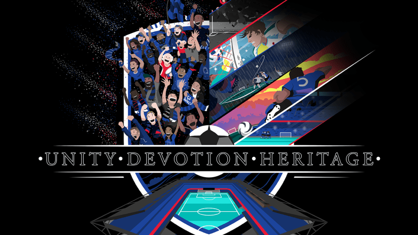
As Quakes Season Ticket Holders start to receive their 2017 Season Ticket Holder Boxes ahead of the highly anticipated March 4 Home Opener, we sat down Earthquakes Assistant Kit Man Eric Weber, the box illustrator. This isn’t the first Quakes illustration from Weber, who is responsible for the 20th Anniversary Clash and Silence the Sounders Poster last season. Check out what Weber had to say about the inspiration behind the colorful box design and the notable Quakes players featured in the crest.
SJEarthquakes.com: The Season Ticket Holder boxes are being delivered as we speak! What do you think of your final design on the box?
Eric Weber: "I really like how it turned out. I think I redrew the graphic three times because I wanted to make sure it was the right one. It was crazy because they were totally different designs each time."
SJEQ: How long did it take you to make the illustration on the Season Ticket Holder box?
EW: "I would say it took me three weeks. The first two were pretty boring to be honest and the funny thing was I settled on the last design a week before submitting to the Quakes marketing team and I had worked on the previous two designs for two weeks. It was totally a last minute change but it worked out perfectly. I also went through three to four different color schemes as well. At one point, I had the sky sketched out as hot pink and yellow."
SJEQ: Explain what inspired the theme of the box and what fans can expect to see featured in this colorful design.
EW: "The theme of the box design was the club’s brand pillars - “Unity, Devotion and Heritage.” My goal was to play on those three themes. As far as heritage, I was trying to come up with historical moments and illustrate the different eras the team has gone through. I wanted to get the fans in there and the stadium. The whole point of the season tickets is having the fans inside Avaya Stadium, so I definitely wanted to capture that. It was tough to get all three of them into one piece. At first, I thought maybe I would just focus on the stadium or just focus on fans or just focus on the history. I just started messing around with the logo itself and seeing what could be done with it. The image itself is overlaid onto the Quakes logo. You have the shield shape and then the ball in the center. I also had the stadium popping out of the logo with the fans extending out of the boundaries of the image. I also wanted to play a little bit on the pattern and have it in the color scheme of the history pictures on the right and the fans on the left. Lastly, I added the two stars on the crest to represent the club’s two MLS Cups."
SJEQ: Who are the players and fans highlighted in the design?
EW: "On the right side of the box I had notable players featured, including Johnny Moore, Eric Wynalda and a huddle of the current team inside Avaya Stadium. I wanted to separate each time period with our tectonic pattern which worked out nicely. Then on the left side of the crest I included Quakes fans and Krazy George with his drum. You can’t miss him."


